


Where Design Meets Innovation and Culture
CLIENT
1
2
PROJECT TYPE
3
SERVICES
4
YEAR
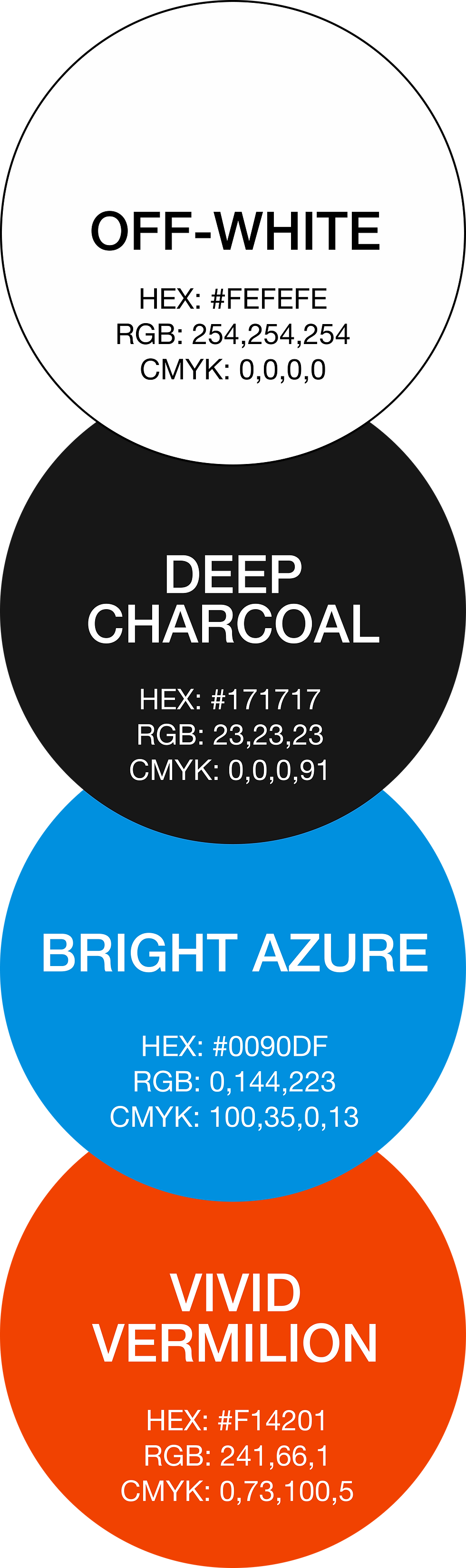
TOOLS
5
Campaign
ART DIRECTION
Visual Identity
21_21 Design Sight
GRAPHIC DESIGN
2024
Where Design Meets Innovation and Culture
CLIENT
1
2
PROJECT TYPE
3
SERVICES
4
YEAR
TOOLS
5
21_21 Design Sight
GRAPHIC DESIGN
Campaign
VISUAL IDENTITY
ART DIRECTION
2024
background
21_21 Design Sight, founded in 2007 by Issey Miyake and designed by Tadao Ando, is located in Tokyo’s Roppongi district. The museum serves as a platform to explore the role of design in everyday life through innovative exhibitions, workshops, and talks. Its minimalist architecture, including a steel roof inspired by Miyake’s A-POC concept, reflects a blend of tradition and modernity. The exhibitions typically focus on product design, fashion, architecture, and visual art, aiming to challenge conventional perspectives and inspire creativity. By showcasing both established and emerging designers, the museum invites visitors to reflect on how design shapes culture and society.

OVERVIEW
For this project, cohesive branding materials were developed for two concurrent exhibitions: Another Kind of Art in the Main Gallery and Futures In-Sight in the Side Gallery. Each exhibition had a distinct theme, requiring tailored designs that reflected its narrative while maintaining visual consistency with the museum’s identity. A unified yet adaptable design system was created across multiple touchpoints, ensuring that both exhibitions stood out individually while contributing to a cohesive museum experience.
MAIN GALLERY


Another Kind of Art highlights the Japanese Mingei movement, which celebrates the beauty of handcrafted everyday items made by anonymous artisans. Rooted deeply in Japan’s cultural and regional traditions, Mingei reflects the nation’s climate, customs, and craftsmanship, passed down through generations.
ART DIRECTION
The exhibition visuals feature a red and blue eclipse on a white background with slanted black text, creating a cohesive and meaningful representation. The blue eclipse reflects the museum’s logo, reinforcing its branding, while the red eclipse symbolizes the Japanese national flag, connecting directly to the exhibition’s focus on Japanese Mingei. The white background provides a clean, minimalist canvas, echoing the simplicity inherent in Mingei aesthetics. The slanted black text adds a dynamic, contemporary touch, bridging traditional and modern elements and aligning with the exhibition’s exploration of Mingei’s evolution and relevance today.


PROMOTIONAL MATERIAL
POSTER
This mockup showcases the exhibition poster in use, demonstrating how the design elements visually represent the museum’s identity and the exhibition’s theme in a real-world setting.

PROMOTIONAL MATERIAL
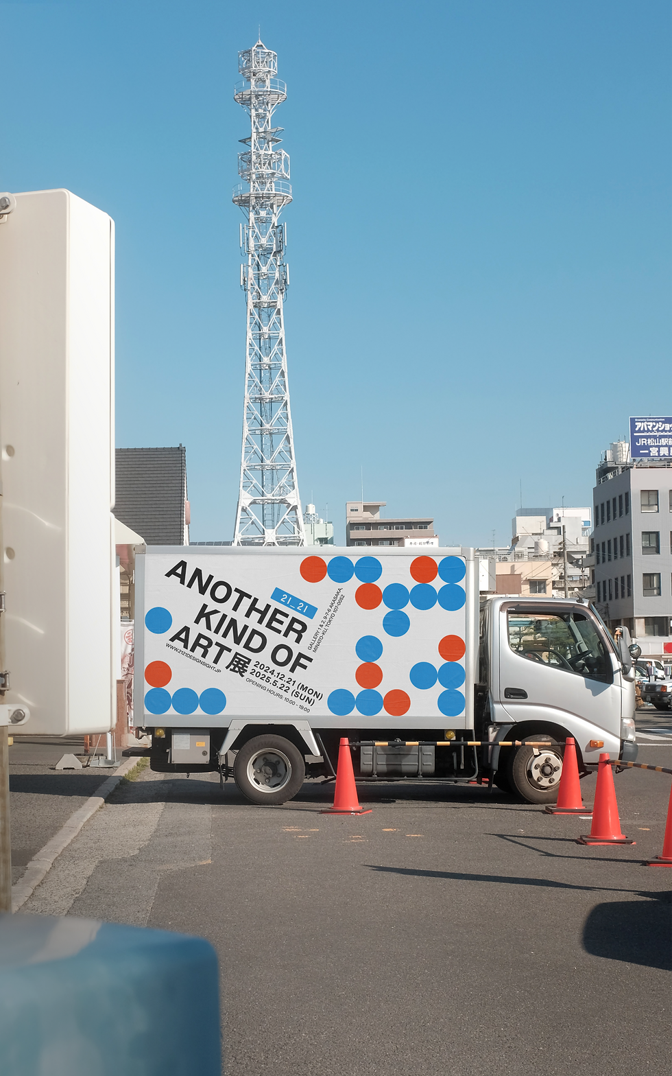
Urban advertising poster & banner

Displayed near the museum, these banners effectively communicate the exhibition’s theme while guiding visitors to the venue.


souvenir item
Folder
The official souvenir folder, designed with a layered red and blue eclipse motif, blending function with aesthetics as papers partially cover the back layer.

Access and Entry Materials
Digital Ticket
Access and Entry Materials
Designed for a cohesive visitor journey, the e-ticket integrates the exhibition’s iconic eclipse motif.
ID cards for staff and guests
Staff and guest ID cards maintain a cohesive design, using contrasting color schemes for easy distinction and access control.


SIDE GALLERY
_edited.jpg)
.png)
The exhibition Futures In-Sight delves into diverse perspectives on the future, looking a century ahead from its opening. It explores how advancing technologies, global challenges such as the pandemic, and human creativity shape our understanding and predictions of what lies ahead.
Art Direction


The visuals feature a dark background with white text, creating a striking contrast that enhances the futuristic aesthetic. "FUTURES" is emphasized with an enlarged font and a subtle blue outline, producing a dynamic 3D effect that shifts depending on the viewing angle—appearing either raised or recessed. This optical illusion reinforces the exhibition’s theme, symbolizing the complexity and uncertainty of the future.


Promotional Material
A dual-color version of the banner, elegantly hung along the street to enhance visibility and appeal to passersby.
Urban advertising banner & flyer

Souvenir Item
bookmark
A collectible bookmark designed as both a functional keepsake and a promotional item. Featuring a sleek dual-color design, it aligns with the exhibition’s visual identity while providing visitors with a practical souvenir.

Access and Entry Materials
Digital Ticket
Optimized for digital wallets, it features a streamlined layout with a QR code for seamless entry. Available in light and dark modes, the design ensures clarity and accessibility while maintaining a sleek, modern aesthetic that aligns with the exhibition’s visual identity.
Access and Entry Materials
ID cards for staff and guests
Designed for seamless event access, the ID cards distinguish staff and guests with a black and white color scheme. The staff version features a black background with white text, while the guest version inverts the design, ensuring clarity and maintaining the exhibition’s cohesive branding.

Promotional Material
social media post


Let's Work Together
bY CHRISTY LAM 2025
Resume
Let's Work Together
bY CHRISTY LAM 2025
Resume
Let's Work Together
bY CHRISTY LAM 2025
Resume
Let's Work Together
bY CHRISTY LAM 2025
Resume
Let's Work Together
bY CHRISTY LAM 2025
Resume
Let's Work Together
bY CHRISTY LAM 2026
Resume
Let's Work Together
bY CHRISTY LAM 2025
Resume
Let's Work Together
bY CHRISTY LAM 2026
Resume
Let's Work Together
bY CHRISTY LAM 2025
Resume
Let's Work Together
bY CHRISTY LAM 2025
Resume