


Celebrating Diversity through Design
CLIENT
1
2
PROJECT TYPE
3
SERVICES
4
YEAR
TOOLS
5
Campaign
ART DIRECTION
Visual Identity
HOLLAND FESTIVAL
GRAPHIC DESIGN
2023
BACKGROUND
The Holland Festival is one of the Netherlands' most prestigious and long-standing cultural events. It is held annually in Amsterdam. Established in 1947, it is a celebration of the arts, with a focus on theater, dance, music, opera, and multimedia performances. It aims to showcase innovative and diverse works from emerging and established artists, often presenting international productions and fostering cross-cultural exchange.

OVERVIEW
This project was developed to create a suite of advertising materials for the Holland Festival 2023, including posters and banners. Inspired by the design philosophies of Dan Friedman and Ellen Lupton, the poster integrates bold layering, dynamic type scaling, and transparency to reflect the festival's themes of freedom, diversity, and creative expression.

Art Direction
SEASHELL
HEX: #F1F1F1
RGB: 241,241,241
CMYK: 0,0,0,5
ONYX
HEX: #0E0E0E
RGB: 14,14,14
CMYK: 0,0,0,95
LAPIS BLUE
HEX: #143982
RGB: 20,57,130
CMYK: 85,56,0,49
colors
The design incorporates a palette of Seashell, Onyx, Lapis Blue, Reddish Orange, and Macaroni and Cheese. These colors evoke a sense of modernity and vibrancy while ensuring readability and visual intrigue. The inverted background colors establish a transparent effect, giving the poster a sense of fluidity and openness.
REDDISH ORANGE
HEX: #EB491E
RGB: 235,73,30
CMYK: 0,69,87,8
MACARONI AND CHEESE
HEX: #F0B732
RGB: 240,183,50
CMYK: 0,24,79,6
HK GROTESK
HEADINGS
Aa
NOTO SANS
SUB-HEADINGS & BODY TYPE
Aa
ABCDEFGHIJKLMNOPQRSTUVWXYZ
ABCDEFGHIJKLMNOPQRSTUVWXYZ
1234567890
ABCDEFGHIJKLMNOPQRSTUVWXYZ
ABCDEFGHIJKLMNOPQRSTUVWXYZ
1234567890
fonts
HK Grotesk and Noto Sans were selected for their modern, clean lines and versatility. HK Grotesk provides structure and clarity, while Noto Sans adds elegance and readability. Together, they ensure the typographic elements are both functional and expressive.

TYPE SCALE + LAYERing
The poster features oversized typography where the word "Holland" anchors the composition with bold, solid text, creating visual stability. In contrast, "Festival" is presented with a transparency overlay, blending harmoniously into the background layers. The interplay of varying type sizes, weights, and styles creates rhythm and depth, reflecting the festival’s dynamic and multifaceted nature.

type scale differences


LAYERing


Symbolism Through Imagery
The bird motif symbolizes freedom, cultural exploration, and the universal connection of art and music. These elements serve as metaphors for the festival’s ability to transcend boundaries and celebrate diversity. The birds are integrated into the layered design, creating a seamless connection between imagery and typography.


GRAPHIC ASSETS

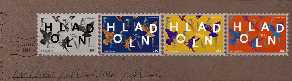
[ POSTAGE ]


[ BANNER & POSTER ]
_gif.gif)


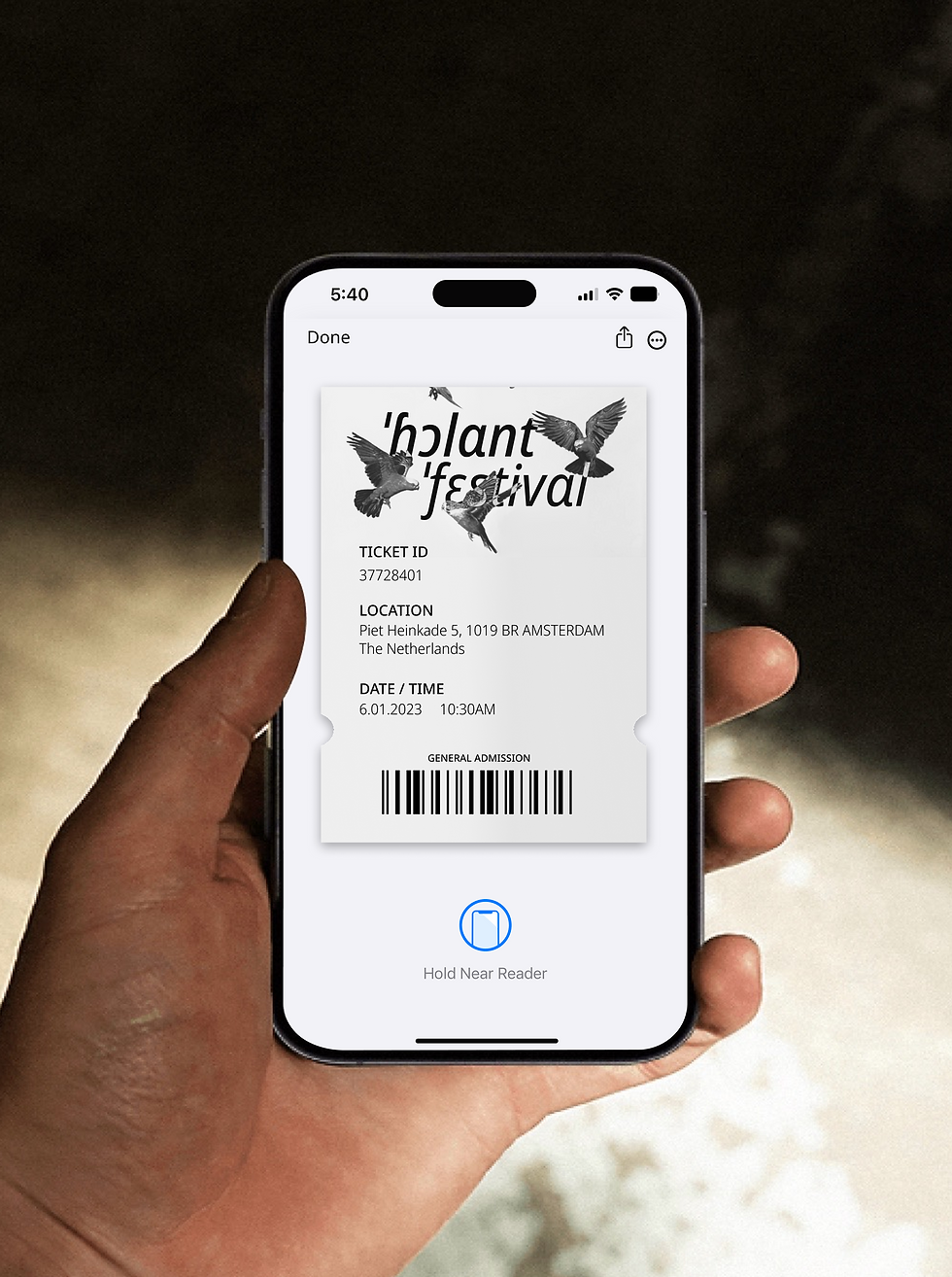
[ E-TICKET ]

[ physical TICKET ]


[ advertisement ]
[ program booklet ]


[ SOCIAL MEDIA POST ]


3

Let's Work Together
bY CHRISTY LAM 2025
Resume
Let's Work Together
bY CHRISTY LAM 2025
Resume
Let's Work Together
bY CHRISTY LAM 2025
Resume
Let's Work Together
bY CHRISTY LAM 2025
Resume
Let's Work Together
bY CHRISTY LAM 2025
Resume
Let's Work Together
bY CHRISTY LAM 2026
Resume
Let's Work Together
bY CHRISTY LAM 2025
Resume
Let's Work Together
bY CHRISTY LAM 2026
Resume
Let's Work Together
bY CHRISTY LAM 2025
Resume
Let's Work Together
bY CHRISTY LAM 2025
Resume